Our Website Has Had A Redesign!
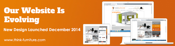
Our Website Has Had A Redesign!
Have you ever been browsing the web when you have stumbled across a website that looks like it has stepped straight out of the 90's? Well, that is what our old design was like. We decided we needed a change. A fresh start. A kick in the right direction. Time to take off the grandad clothes. Get down with the kidz ( with a z, not an s). We aimed to achieve a modern design and we believe we have achieved just that. But we do still see room for much more improvement which we are going to be be constantly working on to make your web browsing time more enjoyable!
Lets start off with the menu bar. Before, we had some links on the top which weren't even related to products; they were more about our policies which, it is a given, they are important but they more belong at the bottom of the page. The product categories were located on a menu bar to the side which I personally feel is a step back. It belongs at the top of the page as this is where most people tend to look. We have also changed the categorisation of products too to make items easier for you, the customer, to find what it is you are after.
Next, the home page. We decided to keep the main image slider as we felt this showcases some of our products in a better light. It can also provide inspiration of layouts and what products work well together. Below the slider we have some tiles. This is to keep in line with the fact that most users have touch screen laptops and tablets as well as keeping in line with the Windows 8 tiled effect. We loved the idea of minimalist design so we based a lot of our website around that. For our theme we wanted to use just simplistic & flat colours, and we mostly only use grey and orange in line with our logo. And as discussed in the previous section, all our policies and such are located at the bottom of the page.
For the product listings, we have been focused on getting high quality images because people like to know what they are buying, right? If I went onto a site and all they had is really blurry images i'd probably go elsewhere. It's either that or i'd expect the product to turn up blurry... Having high quality images allows you to see your product in a better light, more detail. As well as updating the images, we have been focused on updating the product descriptions so they don't just talk about the product's history, but also contain details of the product itself. Such as including details of materials used, dimensions, etc. We understand that a fair few of our products don't have pricing on them and it is annoying having to call or email to just see a price, therefore we are also trying to but a base price on the products at the very least. This is because we know that when buying a product, you will surf the web to find the best price and you want to see the price immediately to compare. We are humans here at Think Furniture. We also surf the web for best prices. ;)
One feature that will appeal to architects and interiors designers is our Project List. If you are browsing our site for ideas on a project that you are working on, you can add the items you like to your very own project list by clicking the "add to project list" button located under the "add to cart" button. You will need to register with us first in order for us to save the list for you, but that's a quick 5 minute job, probably even less if you are using a browser with an auto fill function. After you have added all the products you require to your list, send us the link to our info@think-furniture.co.uk email and we will price up all the items and give you our best deal. You can also have more than one project list if you are working on multiple projects!
Other things we have included is a link to our Trustpilot reviews at the bottom of the page as well as having Live Chat. We feel this was necessary as with a lot of our products people want to know more for the price they are spending.
We welcome any feedback on our design. Simply send you comments to info@think-furniture.co.uk